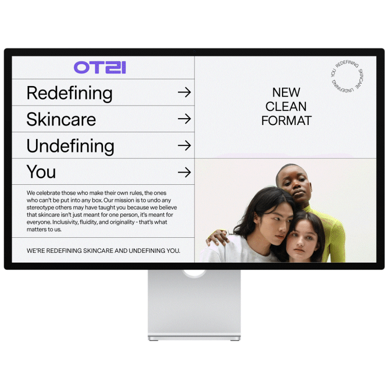
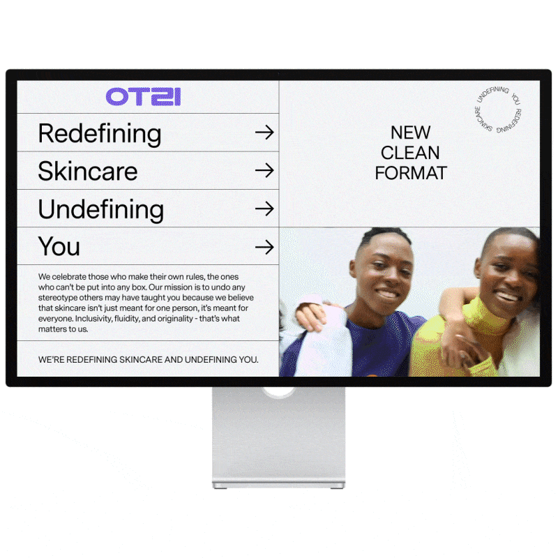
OTZI was derived from a glyph anagram of the Korean word ‘우리 <oo-ree>,’ which translates to the word ‘us.’ The brand’s mission statement held a strong emphasis in building a diverse community that would benefit from an encompassing product line; achieved through visual imagery along with stricter guidelines to what connotes to vegan/cleaner ingredients that is present in skincare product concoctions. Through focus group testing and trend assesment, the typeface and color schemes that were chosen to represent the brand’s campaign identity proved to be a stronghold based in its style guide. Visuals were inspired by the early aughts if it were defined by contemporary standards, 20 or so years later.
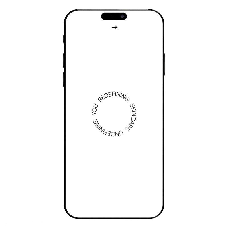
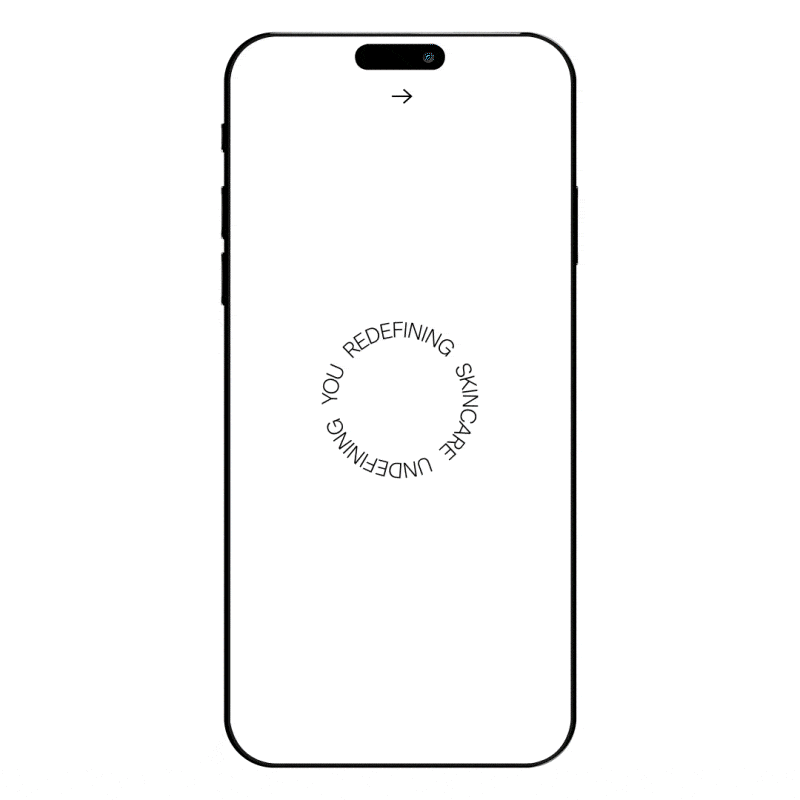
OTZI Marketing/Digital Campaign
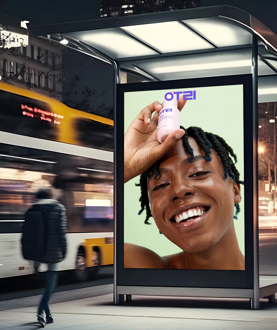
OTZI Transit Hub Advertisement Activation
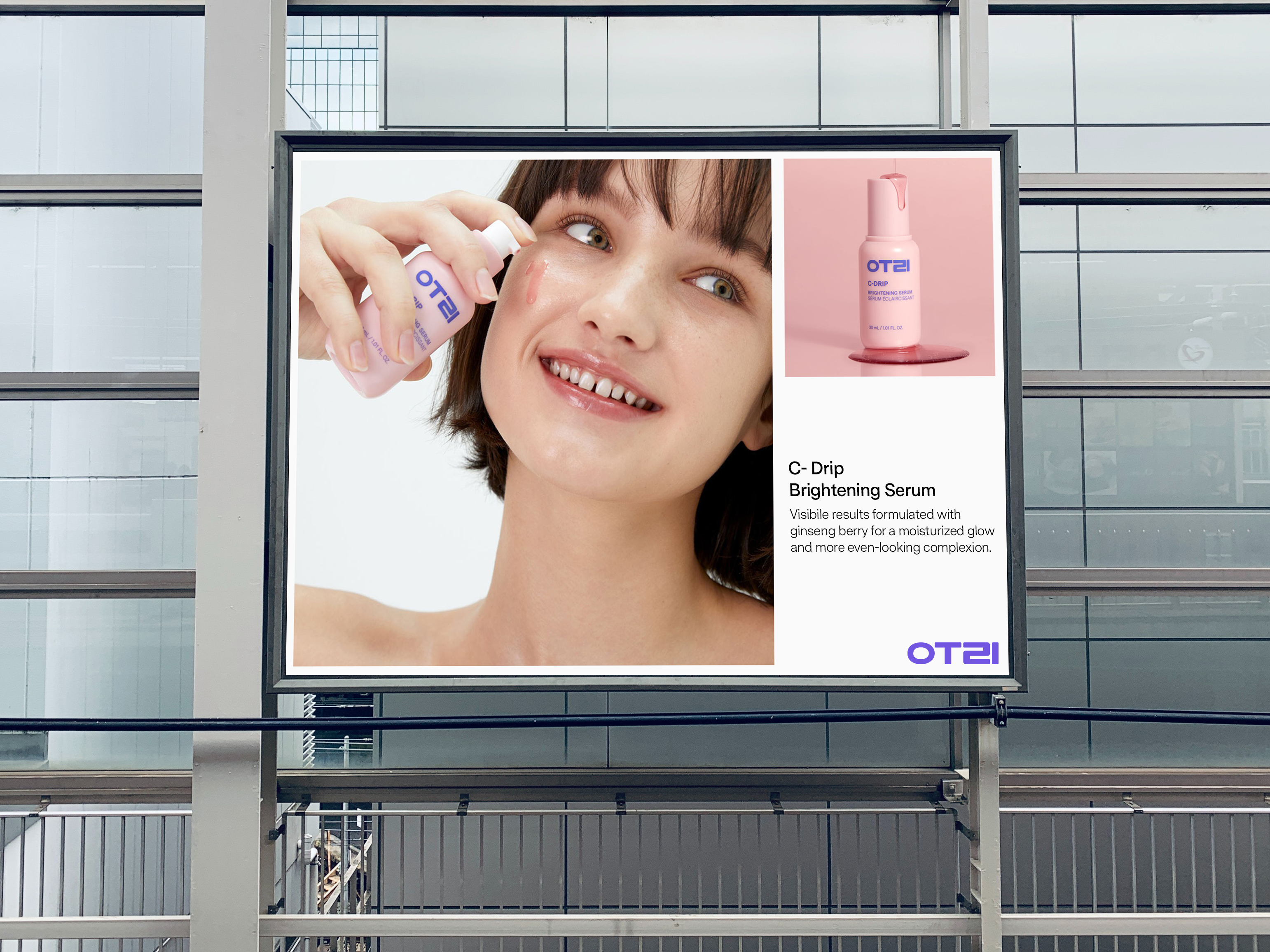
OTZI Beauty and Product Photography
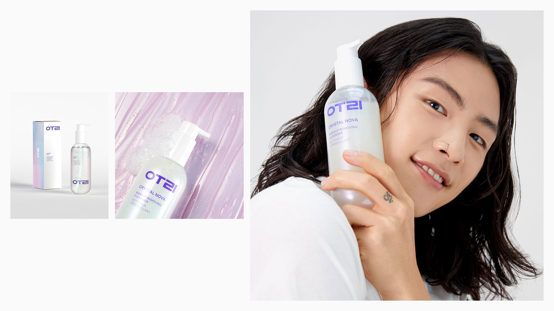
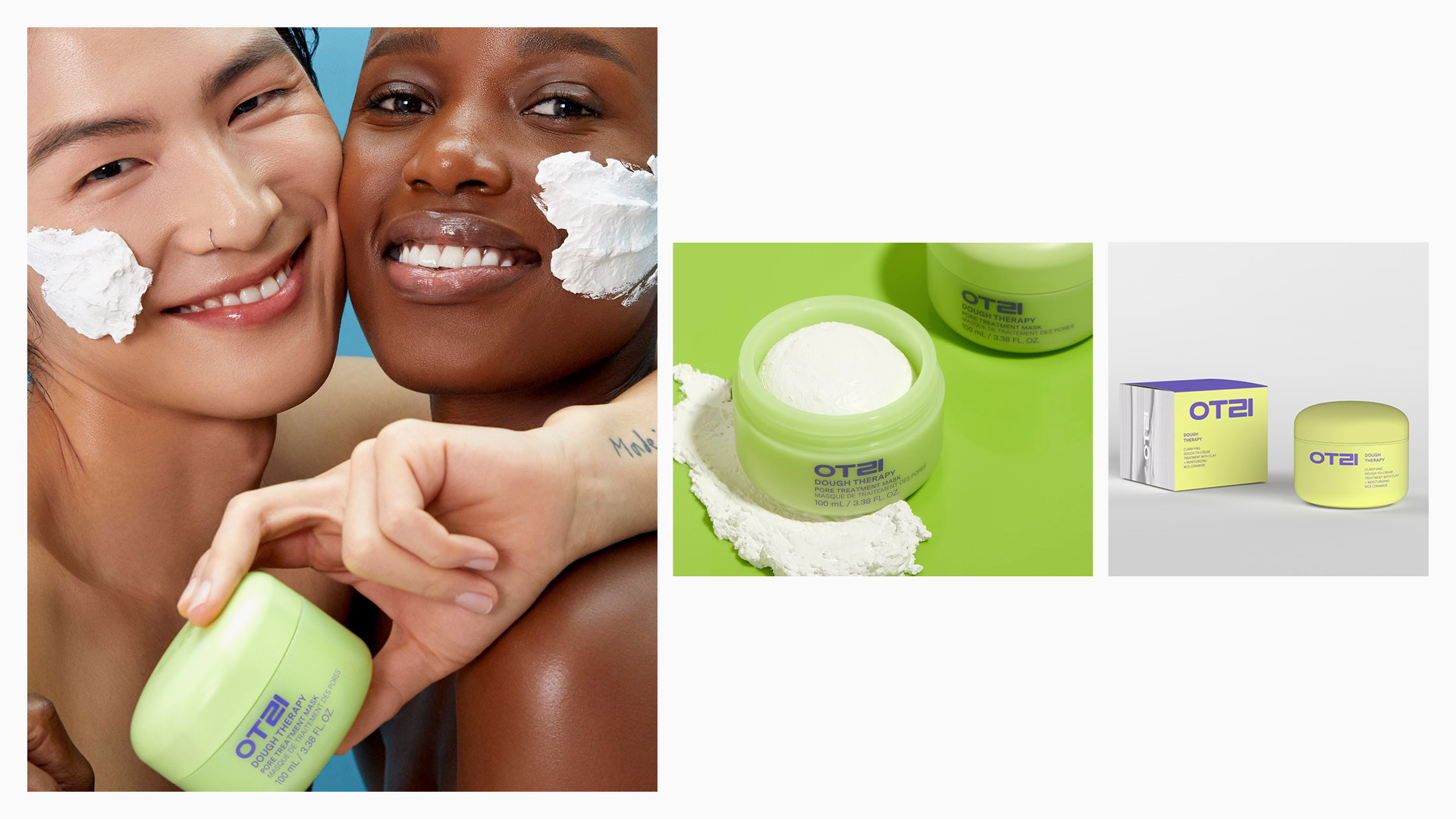


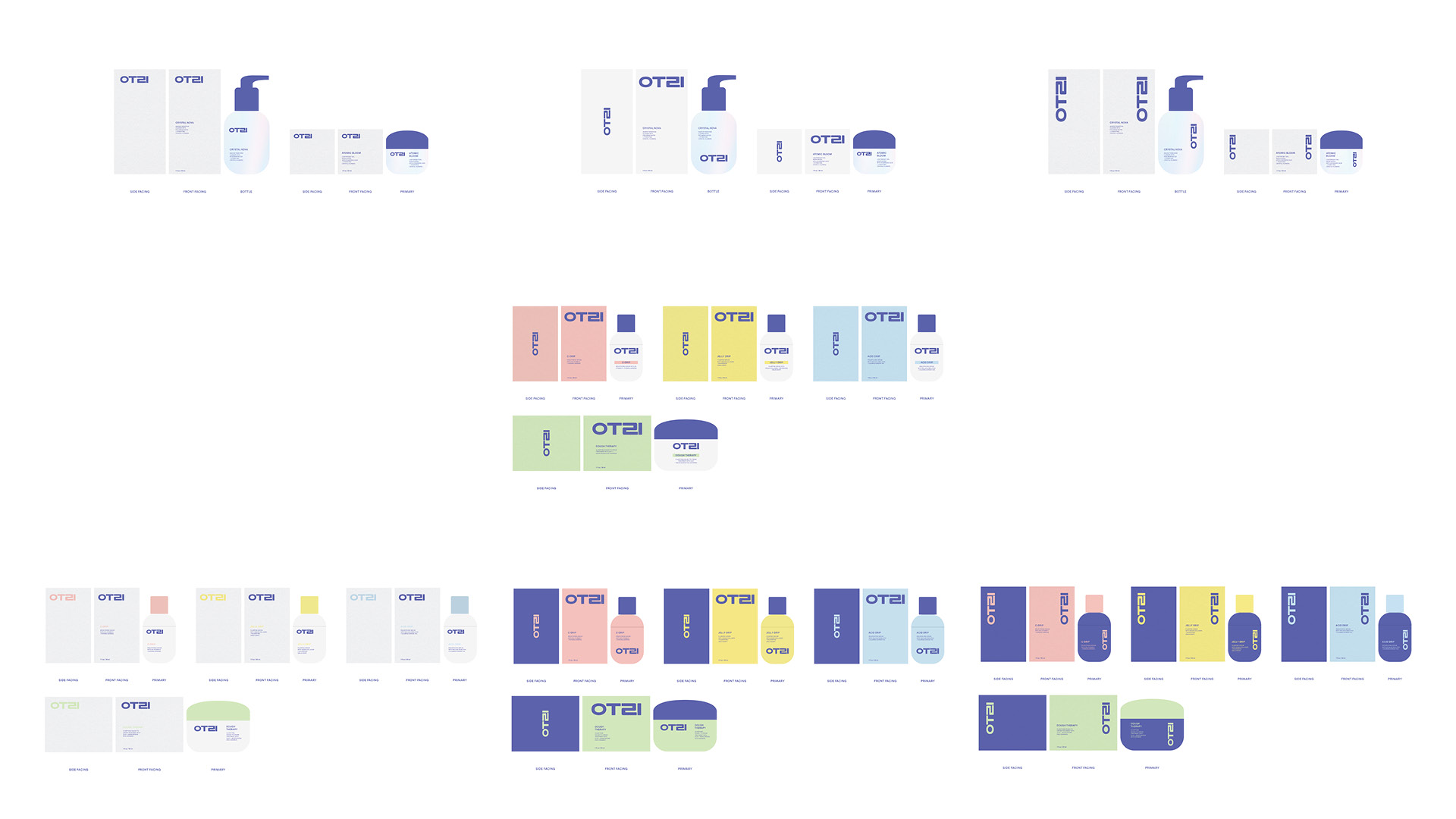
OTZI Product Packaging Design Rendered Imagery and Exploration